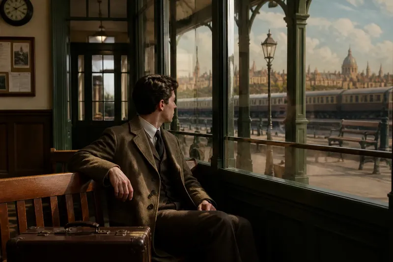
The Myth That Every Colour in a Film Is a Code
Film color meaning depends on context, not a universal code. Learn to read hues through nearby images, repetition, lighting, and changes across a scene.
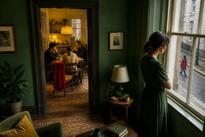
A red coat crosses a gray station platform, and someone in the audience whispers, “Danger.” That may be a useful first impression, but it is not yet an explanation. Film color meaning comes from the images around a hue, the way it returns, and what changes when it appears.
The idea that every color has a fixed message is tempting because it makes a complicated screen world feel easy to decode. Red means passion, blue means sadness, green means envy: familiar pairings can guide a viewer, but they cannot tell the whole story. A color works less like a word in a dictionary and more like a note in a conversation. Its tone depends on who or what surrounds it, and on what has already been said.
Color associations are starting points, not answers
Viewers bring personal and cultural associations to a film. A white dress may suggest ceremony to one person, grief to another, or simply the character’s practical choice in a bright setting. Those impressions matter, but they are not automatically the filmmaker’s intended message.
Genre and setting also shape what seems meaningful. A crimson curtain in a theater may belong to the room’s ordinary decor; a small crimson mark in a mostly pale hospital corridor may stand out sharply. The same color can feel lush, threatening, festive, or unremarkable depending on its surroundings.
It helps to separate three questions: What do I associate with this color? What does the shot visibly emphasize? What does the film do with the color over time? The first question is personal, the second concerns composition, and the third tests whether a pattern actually develops.
Nearby images change what a color can suggest
Before assigning meaning, look at the whole frame. Notice the hue’s size, location, brightness, and relation to other colors. A blue wall may be background in one shot and a strong visual barrier in another, depending on where the actors stand and how the camera frames them.
Lighting can alter a color’s appearance without changing the object itself. A yellow kitchen bulb may make a white shirt look warm; cool daylight through a window may shift the room’s balance. Costume, set paint, props, and lighting overlap on screen, so the visible effect is not always attributable to a single design choice.
Ask what else shares the frame. If a character wears green while plants, furniture, and practical lights echo that hue, the costume may blend into the setting rather than announce a symbol. If the same green appears alone against a field of neutral tones, it may pull the eye—but visual prominence is not the same thing as a fixed meaning.
Camera movement and editing matter, too. A color can gain weight because the shot holds on it, because the viewer sees it just before a decision, or because a cut places it beside a contrasting image. The surrounding sequence may make the color feel like a transition, a warning, a memory, or simply a striking visual link.
Repetition turns a hue into a pattern
A single appearance is weak evidence for a recurring motif. To judge whether a color matters across a film, notice where it returns and whether those returns share a situation, character, object, or change in mood. Repetition creates an opportunity for meaning; variation gives that meaning shape.
Imagine a fictional drama in which a character wears a yellow scarf in an early scene at a crowded bus stop. Later, yellow appears in a kitchen lamp during a tense family meal, and near the ending the scarf shows up folded on an empty seat. The color alone does not prove a message. But the viewer can compare who is present, how the framing changes, and whether the scarf’s final placement recalls the opening scene or changes its emotional emphasis.
That imagined sequence also shows why an exact match is not required. A recurring hue might shift from a costume to a practical light, or from a saturated object to a muted reflection. What matters is whether the film invites the viewer to connect those appearances through timing, placement, or association.
Repetition can also be incidental. A production may use a color because it suits the location, costume palette, or available light, and the hue may recur without carrying a narrative message. Treat a pattern as a question to investigate, not a code that solves itself.
How should you read a color motif?
Does red always mean danger?
No. Red can draw attention, mark a character’s clothing, belong to a room’s decor, or echo an earlier image. Look at what the film places around it and whether its appearances connect to the same event or changing relationship.
How can you tell a motif from a one-off color choice?
Notice whether the hue returns in a way the film makes visible through framing, timing, or contrast. A repeated color becomes more suggestive when its context changes in a meaningful way, but recurrence by itself does not establish a single intended interpretation.
Does lighting change a color’s meaning?
Lighting changes how a color looks and how strongly it stands out, which can alter its effect in a scene. Compare the object with nearby surfaces and consider whether the light itself is part of the image’s mood or setting.
What if viewers disagree about what a color means?
Different responses are normal because viewers bring different associations to the same hue. Ground an interpretation in observable details—where the color appears, what accompanies it, and how it changes—rather than insisting that one personal association must be universal.
Separate a viewer’s reading from a claim about intent
It is fair to say, “The green feels uneasy to me here,” especially if you can point to the dim room, the character’s stillness, and the return of green near a difficult decision. It is a bigger claim to say, “Green means betrayal in this film.” That statement needs a pattern strong enough to support it, and even then it describes a reading rather than revealing a secret key.
This distinction keeps interpretation open without making it vague. A viewer can offer a clear argument: identify the color, describe its neighbors, trace its recurrence, and explain how the context changes. Another viewer may notice a different pattern, and the conversation can test both readings against the same images.
It also helps to avoid treating every design choice as a deliberate symbol. A costume may need to stand out against a set, a wall may carry the colors of its location, or a lamp may simply look natural in the scene. Those practical functions can coexist with expressive effects, but the image alone cannot always tell us which purpose came first.
A useful way to watch for color meaning
On a first viewing, let the color register before naming it. Note what catches your eye and what feeling follows, without treating that reaction as a final answer. On a later viewing, track the hue’s appearances and ask whether the film links them through composition, character, place, or editing.
Then compare the moments rather than flattening them into a label. Does the color move from background to foreground? Does it appear with one character and later without them? Does its brightness shift, or does the scene around it change? These questions turn film color meaning into close observation instead of a hunt for a universal legend.
A useful interpretation should explain more than one image while remaining honest about uncertainty. If a proposed meaning fits a returning color but ignores the scenes where it behaves differently, revise the idea rather than forcing the evidence. The strongest reading is often not “blue means sadness,” but a more precise observation about how this film uses blue in these particular moments.
So when a vivid hue seems to announce a message, pause long enough to see the frame around it. The color may still feel urgent, tender, or strange; the surrounding images help explain why. And if it returns, its changed company may tell you more than the hue could ever say alone.